Sunday, April 1, 2012

Evaluation Activity 4 - How did you use new media technologies in the construction and research, planning annd evaluation stages?

One way in which my group decided would be an appropriate way to look at all the media technology that we had used would be to take photos of myself holding the equipment which I then uploaded onto blog.. We have also used some other forms of media which I have discussed below:


  • Above Sarah has taken a photo of myself holding the camera and tripod that we used to film our trailer.
  • We used a DV1 camera to record the action/footage within our trailer, this included a variety of shots, movements and angles displayed within our film trailer.


  • The camera that we used proved to be very reliable and managed to record much of the action in fairly high quality, which was an improvement to the camera's that we had to work with last year.
  • We used the camera mainly for the picture and the microphone for the sound however, on some of the camera movements there were not a lot of dialogue or in some shots no dialogue, only background noise. When we uploaded this footage onto adobe we did not want to amplify any particular back ground noise so we managed to edit this out by using music over the top.

  • We used a tripod to steady our shots while filming. I think this helps us achieve a professional effect and a better viewing experience for our audience.
  • During editing all three of our ancillary tasks (trailer, magazine front cover and movie poster) we used Adobe softwarre, this included Adobe Premiere Elements.
  • We used Adobe Premiere Elements to edit together our teaser trailer, this gave us the option to cut together scenes, take parts of footage out, put in effects and transitions, speed/slow down footage using timestretch and enter in inter-titles.
  • We also used Adobe Photoshop and Illustrator to manipulate the images that we used on our magazine cover and poster.


Adobe Premiere Elements


Adobe Photoshop


Adobe Illustrator


  • I used Prezi as a way of uploading my powerpoints that we had created things such as, storyboard and magazine front cover analysis. I found prezi a useful way to translate my powerpoints onto my blog.


  • Blogger was the main piece of media that I have used to create my coursework and record the progress that I have made throughout the year and also in my AS year.


  • I have used windows paint to print screen images and upload them into paint, I have then been able to cut out parts of the image such as pictures that I have found useful during my research and planning for our teaser trailer.
  • We also used youtube to find other teaser trailers and study them. We also had to create an account and upload our own videos onto this such as our teaser trailer and preliminary tasks, which meant people were also able to comment on them.


  • All of these media texts have been able to help my group and I accomplish what we have and also have given us the ability to have free range over our creative choices and where we have got our inspiration from, we would not have been able to complete our coursework efficiently without the above media products.

Evaluation Activity 3 - What have you learned from your audience feedback?


Above I have posted our audience feedback that we took in class, after hearing our audience feedback we went back and improved all the reponses we got from our audience.

  • My group and I had decided that we did not want to base our trailer on just one other trailer, instead we wanted to take many features from other trailers that we had enjoyed, found exciting, frightening and overall stood out to us against other trailers.

  • With these different features, we then formed the inspiration for our own trailer. Such as the bench scene whereby Emma was sitting alone which was really original and we had seen this scene used successfully in other films such as '500 Days Of Summer' which gave the image of the character as a victim in the film.

  • Before deciding on our final music for our trailer, my group and I looked into other trailers which had the music playing through the intertitles which we thought worked effectively throughout the trailers. Many of the trailers we looked into had really effective music in creating a tense mood to the audience. This is a typical feature you find in horror trailers and so we looked into many non-diegetic music tracks from non copywright websites and chose our music to create the same intense atmosphere with our audience. We are really pleased with the way in which the music fits in with the footage in the trailer.

  • I also feel that the fast montage editing in our trailer really suggests the horror genre of our trailer, although there are a few longer shots in our trailer, we have still managed to create a conventional film trailer.

I think that the strengths of our teaser trailer are:
  • The music for our trailer worked well in which it managed to represent the genre of our film. The music managed to create a tense vibe throughout the trailer, keeping the audience in suspense.

  • I thought the titles that we managed to create, with the black background and white writing and also blurring out the writing towards the end of each word really exaggerated the features of the titles. We thought this worked effectively throughout the whole trailer which kept the audience intrigued.

  • My group and I used a range of different locations which fitted into the horror genre. I think this worked effectively as we used locations such as woods, house, alley ways which followed typical conventions in a horror film and by having our trailer in more than one location it made it more believable to the audience. By using a variety of locations if created an extra advantage by highlighting features with in the scenes such as when the victims eyes move, sensing a vibe of vulneralbility and something is not right, or when the 'stalker/killer' is looking through the window stalking the victim. I feel that if we did not use the variety of locations, the audience may not find our trailer realistic and believable.

  • What I also thought worked well, was being able to edit in a scream right at the end of the trailer, just after you see the victim walking through the alley way, which then cuts to showing the 'stalker' following on behind. I would say this is quite un-conventional as I haven't seen this happen in many film trailers.

  • I also feel that the way in which we edited the shots together, by using a variety of transitions and effects, was also a strength as the audience do not know much about the narration but understand the characters and their roles, due to the non-linear narrative in a film trailer.


I think the weaknesses of our teaser trailer are:

  • I feel that one of the things that we should have done better was include a bit more dialogue, as we had very little dialogue which you could barely hear due to the music running over the footage throughout the trailer.

  • Even though we were making a trailer and trailers aren't supposed to give away too much of the narrative, I feel that we could have improved the narrative a little better. We didn't follow too much of the story line that we had written before hand, by which this made it harder for ourselves.

  • I also feel that we could have improved on our transitions, editing together each shot to follow on from one to the other. We could have improved this by picking different transitions to make our trailer run more smoothly, possibly adding in a few more flash's.

Comments that we had recieved over social networking sites:
From putting our film on the social netowrking site Facebook, my group and I gained many comments which I have placed under particular questions.
In what ways does my trailer remind you of other trailers?

  • 'I like the way in which you have used fast past shots which you find in many trailers such as 'The Strangers'.
  • I think it looks effective how you have used credits at the end of your trailer.

What do you think are the strengths of my trailer?

  • 'I think the contrast between the Black and White colour scheme, it fits in well with the genre of the film'.
  • 'I really like how the music fits in with the film, I definitely felt that the music in some places matched bits of the footage, by the way in which it started to create tense in some parts'.
  • ' Well done guys, I thought this was good! Liked how you used a variety of locations which made it look realistic.
  • 'The scream at the end I thought worked really well, and it was good how it came in just after the characters went off screen'.
What do you think are the weaknesses?
  • 'One thing you could have done was put it more fast past shots towards the end of the trailer to give the audience more suspense, other than that I thought it was good'.
  • 'I think one thing that would have made it just that bit better, would have been maybe adding in a voice over?'
  • 'You didn't have much dialogue in your trailer, maybe you could have added in some dialogue from the stalker'


Overall I am please with what my group and I have managed to produced and that it is indeed an effective horror trailer, I think that should we have had more time than we could have edited our trailer further, after hearing our audience feedback, correcting our weaknesses.

Evaluation Activity 2 - How effective is the combination of your main product and ancillary texts?

We decided that within our group the best way that we could discuss the question was to type up a script talking about our film as we didn't have enough time to make a voice over. I feel this was a really good way in us developing each others points and giving our own opinions as to the strengths and weaknesses of our trailer and ancillary taks.

To find out as to whether all of our ancillary texts, the film poster and film magazine contributed to the overall film trailer, I needed to have an in-depth analysis, explaining choices as to why we created our products in a certain way.


(Emma (me), Sarah and Kate all introduce our film 'Love Hurts')

Emma: We are the creators of the 'Love Hurts' our romantic, horror genre film

Sarah: We have chosen to include a preview screen and an institution company logo (Paramount) to give an authentic look to our film. Paramount is our chosen institution company as from our research we saw how it has been used for many other horror films that shares a similar genre to our own. We used quick establishing shots to set up the rural location at the start of our trailer, in which rural locations sets up danger but also loneliness for the characters. Setting up a question for the audience, will the characters come across a stranger?

Kate: The three texts (teaser trailer, magazine and poster) all compliment one another. This is because they all have a common factor, each of the ancillary tasks portray each of the characters and the genre of the film. This shows to the audience what the film is about. In all three of these texts we have not given much away about the films happenings, but different conventions are used to create a scary and interesting feel about this film.

Sarah: On our poster, we have used the tagline 'Never trust a stranger' to show to the audience this film is exciting and also keeps the audience in suspense. Also on the front cover of our film magazine we used an image of David which expressed his character and the location to the audience and also complements the genre of our film. We named our film 'Love Hurts' however throughout the trailer the audience become intrigued as to why the film is called 'Love Hurts' as theres not that much action that happens which reflects the title of the film until right at the end of the trailer, whereby you see the victim character walking through the alley way and then the stalker walking behind, then a loud scream. At this point of the trailer the question is raised, so what exactly will this lead to? Again going with this ideea that we did not want to give too much away to the audience.

Emma (me): The running theme throughout our ancillary texts (film magazine and poster) and our film trailer, there is a continuum of a scenic woodland environment, which confronts to the conventions of a romantic horror film, in terms of the location and characters.


Emma (me): The three ancillary tasks compliment one another as they show to our target audience exactly what genre our film is - Romantic horror. Our trailer displays this by how the characters are portrayed throughout our trailer, the stalker always following the victim Emma and the victim seeming vulnerable around the whole situation. Our poster includes the vulnerable victim character sitting on a bench in the middle of the woods, this is made clear to the audiene that the character could meet a stranger at some point, which could possibly turn into a romance? Also the font that we have used for our poster shows our genre, also through the use of our colour scheme, black white and red, which is typical horror colours. Our magazine cover shows our genre through the image we have used which managed to portray our genre, showing the facial expression on the stalkers face and also by the audience getting a small glimpse of the location in which the character is in, rural location, stereotypical location in a horror film. Also in the same way as our poster, the colour scheme and font shows our genre too.


Overall I feel that we had successfully combined all three to look as if they were all working towards the same effect to attract our target audience and make them want to go and see the full film. The only thing that I would have liked to develop on would be the magazine cover in making the text stand out more from the background and possibly adding more information about other horror films.

Evaluation Activity 1 - In what ways does your media product use, develop or challenge forms and conventions of real media products? (i.e of teaser trailers/poster/magazines)

Within this post, I will be analysing at how conventional/un-conventional our trailer is compared to a typical horror trailer such as 'The stranger' or 'Valentine' for example.


  • Here I took a screen grab of the title of our trailer 'LOVE HURTS'. This appears pretty much right towards the end of our trailer and is one of the last pieces of information the audience have in their mind after watching the trailer and so are able to go and look at it in more depth and remember it when they see it either on the poster of the magazine cover that we had created. We used the samt font and style as for our inter-title keeping with the theme and making the whole trailer fit together.


  • This shot of the woods represents the main location for our trailer. We chose two typical settings where you would expect a conventional horror film to take place, and whereby we used the woods where the victim is typically isolated and helpless. The second setting/location in which we used to represent our genre, was an isolated house right by the woods. Both settings appeal to the audience, who are looking for the classic horror film, making it relate-able to them.


  • Similarly to last year we did not need that many props or costumes. The main prop that we used was the mobile phone that the killer/stalker used to show him stalking over a picture of Emma. I think this managed to work well, showing the stalkers character in the film, which also makes them mysterious and adds to the 'eerie-ness' of the character.
  • We tried to create the same effect as with the film 'Valentine' as what makes the killers in that film so scary is that you can never see the emotions on the characters face and this is something that we wanted to do with our killer.
  • The only other props that were used, were the costumes which were worn by the characters. By having our narrative of the film all about a young girl getting stalked, we wanted this to give the impression of real-life horror where it could be seen by the audience as a 'it could happen to you' scenario, where they can empathies with the victims. 


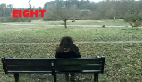
  • The first shot that we chose was the one of our victim Emma (me), sitting on a bench in the middle of the woods. We filmed this scene using a camera, we used a long shot so we were able to fit in the location and character and this was also how the character was first introduced. We made sure that the shot was of an over the shoulder shot, so we did not reveal the face of the character. After filming this scene we watched back the action which was actually pretty frightening, as we also used a pan shot to followon from the same shot as which we had just seen but then used a pan to show that the character had now disappeared however, we wished to exaggerate this feeling in the audience. The pan was at first a little too long however, we managed to find time stretch onn Adobe Premiere and used it to speed up the pan shot. A few of the shots that we had filmed, they ended up being a little too long for our trailer however, it was good footage so decided to use it in our trailer, we managed to use time stretch again to speed up certain shots, this worked out to be effective in our trailer, as we didn't have to cut down many of our shots.


  • Here is an example of our font type that we used throughout our trailer. We used 'Adobe Garamond Pro, size'120' font type in the colour white bold italic, this gave us an effective effect that really added to the atmosphere of the trailer, this font also gave the haunting effect that we see so often in horror trailers. In all three of our media texts (magazine cover, poster and teaser trailer) we changed the font throughout the texts, so all three media texts look different to one another, however you would know that all three media texts come together as one. I think the font for each media text really compliments each other and I feel it makes it look very professional.


  • I feel this shot helped set the narrative of the trailer where you can see David looking over towards the victim, if to say 'you're my next victim'. This adds another story involved which makes the audience want to know more and therefore want to watch the full film. We do not give off too much of the narrative of the film, although it's a horror film, stereotypically the audience know that someone is going to get killed at some point, it's just a point of when.


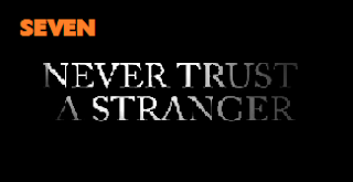
  • I felt that this is a shot that really summed up the genre that we were trying to convey to the audience. The intertitle basically just says it all 'NEVER TRUST A STRANGER', a very stereotypical quote of what you would find in a horror film. The way this whole shot has been presented, represents the genre, the font type, the black and white background and lastly the effect that we added, which was to smoke out the last few letters of each word, which we wanted for our trailer and I think that we were really able to successfully do this with our trailer. I feel my group and I generally do create the moods of fear, suspense and tense within our audience when they watch our trailer.


  • We chose this shot to represent how we introduced our characters throughout the trailer. We only used two characters within our trailer. The two main characters are Emma (me) who plays the vulnerable victim character and David who plays the stalker/killer. The shot shown is of the victim Emma (me) whereby we used a long shot which allows the audience to see the location where the film is set and also the characters in as much/little detail that they may recognize them in the actual film but not know all the details of their face leaving a still good amount of ambiguity around the characters.


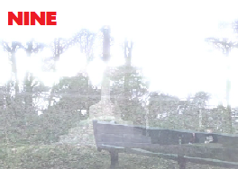
  • I chose this screen grab to show how we had used special effects in our trailer. We used many different effects throughout our trailer to make it look as realistic as possible. We managed to find an effect that worked really well throughout our trailer, it was called 'Dissolve'. This effect was used to be put inbetween a few of the shots to make the trailer run smoothly, so the footage didn't jump from one scene to another, they all managed to flow together. This effect especially worked well as it managed to make one shot dissolve into the next shot, which i personally thought looked very effective in our trailer.

Final Trailer - Love Hurts


Here I have posted our final trailer.

Final Front Cover of Film Magazine


Above I have posted our final Film Magazine front cover.


  • We used a similar technique for the image of the front cover of our magazine to what we did with the poster. We again print screened an image that was in out trailer, this was done to make our magazine front cover realistic and also because the previous image ideas we had taken weren t that good.
  • What I like about our film magazine cover and poster, is that they are both completely different to one another.
  • We used a complete different colour scheme for our film magazine cover such as, white, red, yellow and blue. All of these colours were used as they stand our big and clear to the audience and would be appropriate for a horror magazine.We thought that these colours really work against the picture creating a vivid and 'stand-out' piece.
  • We didn't the image of David as it was already edited from using it in our trailer. This effect allowed you to see more of the facial features than the poster, which I think works well as little by little we reveal more of the characters. We used an effect on the image which is shown above, whereby effect blacks out the background and shows his face. We chose this image as it shows Davids facial expression as he is looking through the window, showing a stereotypical stalker to the audience.
  • We used typical features of magazine covers such as: a bar code, name of the film, date of release and price of the magazine, character, and also extra's such as information about other films that are also out which share a similar genre.
  • We also used a star within the font cover which I feel really adds to the reality of the piece. This also highlights pieces of the texts which brings out interesting pieces of information such as the release date. This is a stereotypicaql feature which is included on the front of many magazine film covers.


I really like our film magazine cover and feel that it sets the tone for our films and really works. It's different to any other film magazine cover that I have seen and if we were to improve our magazine cover, I would just add some more features such as more banners with text in them and also other information on films to advertise.

Final Film Poster


Above I have posted our final film poster.

  • My group and I decided to use an image that was footage in our trailer, we print screened the image and then manipulated the image into black and white effect shown.
  • I think the black and white gives a great effect as seen above, as it enables to represent the horror genre. The image fits in with the enitire poster, and showing the character sitting on the bench, it seems to fade into the background but at the same time stands out to the audience. If a passer by would be induced to have a double look at the poster, at first they might not be sure what the image is, until they have to do a double take. I feel this gives the impression of the character being illusive and eerie because you cannot see the face of the character. This is a conventional image of a character/scene you may find in a horror film, the vulnerable, victim character sitting alone on a bench in the middle of the woods, pretty stereotypical.
  • We decided to use a font that manages to stand out to the reader/audience, and is used throughout the poster. I feel this gives a sense of continuity throughout the poster. The font manages to represent the horror genre and also gives the impression that the font looks like it is handwritten.
  • We have used a black, red and white colour scheme again the conventional horror colours. These colours give the impression of blood, darkness and also innocense seen through the white. These colours also help the text stand out from the image behind it, highlighting the information that the poster is giving them.
  • On the poster we have only given the vital information such as: the title of the film, the catch phrase 'never trust a stranger', 'coming soon' and also the characters in the film. We didn't want to include much else onto the poster as we didn't want to give too much away.
  • We have placed the important information at the top of the poster, as that is where the readers eyes will first look to, so we have put the characters in red to draw the audience straight in.
Overall I am really plreased with the poster, I feel it is very different from other posters so it will stand out but has all the necessary elements to make it a scary realistic horror film poster.

Final Image's For Our Poster/Magazine

  • After uploading the previous images of ideas for our magazine and film poster, My group and I werent to keen on the pictures we had taken, we didn't think that any of them would work well to represent the genre of our film. Sarh then came up with a good idea of using a print screen image from our film trailer. Below I have picked out the two images that we have chosen to use for our film magazine and poster. We thought these two images will work well in representing our genre, and would stand out to the audience. 


  • The image above is the image we have chosen to use for our film poster. We chose this image as it shows to the audience, the location of the film, genre and actress. We have chosen to edit this image into black and white to give off a more eerie vibe to the audience and we think this will work well. We are thinking of having black writing at the top of the poster where the poster is lighter so you would be able to see the writing, with the name of our film 'Love Hurts' and an intertitle in which we have used at some point during our trailer 'Never trust a stranger...'. We will also use red writing for the characters in our film, which will stand out against the black and white background, to represent danger and blood.


  • The above image is the image we have chosen to use for our magazine front cover. We chose this image as it represents our genre, shows the audience who is going to be playing the stalker, and a preview look at the image which will be in our trailer. This image of David, shows that he is looking in on something or someone, which therefore should give an eerie vibe to the audience. This image will stand out on our front cover of our magazine. The image will have a lot of writing around it to make the magazine cover look 'busy'.

Magazine/Poster - Font Ideas

I have made some prototypes of what we could possibly use for our font for our film poster.

 
  • Below I have chosen a white background with black writing, which symbolises the genre of our film, horror. We chose these colours so they will attract in the attention of the audience/reader. I have chosen an italic font that will give an edgy feel to the audience, and is very easy to read. I have made the capital letters for 'L' and 'H' extra big to give an idea to the audience what our film may be about. I have also added 'Never trust a stranger...' underneath 'Love Hurts' to also represent what our film is about. This is an intertitle wherebywe added this into our film trailer, we thought this could work well on the front of our film poster.


  • Above I have added another idea that we have come up with. This would be placed at the bottom of the poster. It is in a similar font to the font I have chosen above, which also represents the genre of our film which helps build continuity and recognizability. This time I have used a black/grey background with white writing, which I think works well. I have kept the writing in capital letters and in italic writing 'COMING SOON', we thought this might work well at the bottom of the poster, to represent that the film will be coming soon, therefore it does not give away which day or month, leaving the audience intrigued. The dark background really accentuates the 'COMING SOON'. What we thought would work well, is if we used information about the film in small writing which you can hardly see underneath the 'COMING SOON' title, to make our poster look more realistic, the writing is also kept the same in white to stand out against the dark background.


  • Above is the 'EMPIRE' logo which we will use for our film magazine. I will erase the black background behind the red writing to make it look more effective. I am glad that my group and I chose to go with EMPIRE, as I think the red writing will fit in well with the dark background that we are going to use.

Poster/Magazine - Image Ideas

Today in our media lesson, myself and Sarah decided that we would go and take a few pictures of myself and David, who played the stalker in our film trailer, we did this to see whether we could get an idea as to what we liked and could use for either our magazine cover or film poster.

We took the photos in two different locations, one lot of photos infront of a white blank wall and the other set of photos located in the common room (6th form room). All of the photos consisited of Emma and David who are the main characters in our trailer. We took a number of different shots, which has given us a variety of choice of which we can choose from for our poster and magazine front cover. The final two images that my group and I decide on, we will edit them both so they look effective for our final products.

Magazine images


The above images are possible images that we may use for our front cover of our film magazine. We have chosen these selected images due to the way the two characters are portrayed in the image. David (stalker) is made to look dominant and over powering in the image, whereby Emma (vulnerable character) is looking up towards David showing fear. I think these images will be good to use for our film magazine as they portray our film trailer and the genre .


Poster images


My group and I have chosen to use these specific images similarly to how the other images above are portrayed. All three images are of Emma and David, showing David trying to hold onto Emma, which suggests the audience might try to make barriers between David and themselves, this again hints the genre and character that we are trying to portray. I find this shot is indeed scary, but it also gives some of the narrative of the film to the audience, showing that David is going to be the over powering, dominated character, and Emma being the vulnerable character. At the moment the images look pretty dark however, I will edit all the images to see which ones work better. The final two images that my group and I choose for our front cover of our magazine and also our film poster, we will make sure that they are both eye catching and really intriguing to the audience to draw them in.

Empire Magazine - Conventions and aspects to consider

Below I have highlighted in yellow all of the conventions and aspects to consider when creating the front cover of a film magazine. These aspects will be used on the front cover of my own film magazine.


Main article
The main article is shown by stating the films title in a large font in the top left hand corner. The main image of the magazine cover should reflect the main article, for example showing the mean character in the film, so this will all reflect our film.


Barcode
Use of a barcode gives an authentic look to the magazine.


Price, Month & Year
Usually in a very small font in the middle of the Empire's 'M' the date of the magazine release e.g. July 2012, the date in pounds and dollars


Quote From The Film
By using a quote from the film, it draws in the reader to want to watch the film


Extra features
Other articles which will be of interest for the reader e.g. other films being released soon.

Empire Magazine - Cover Analysis