Within this post, I will be analysing at how conventional/un-conventional our trailer is compared to a typical horror trailer such as 'The stranger' or 'Valentine' for example.
- Here I took a screen grab of the title of our trailer 'LOVE HURTS'. This appears pretty much right towards the end of our trailer and is one of the last pieces of information the audience have in their mind after watching the trailer and so are able to go and look at it in more depth and remember it when they see it either on the poster of the magazine cover that we had created. We used the samt font and style as for our inter-title keeping with the theme and making the whole trailer fit together.
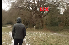
- This shot of the woods represents the main location for our trailer. We chose two typical settings where you would expect a conventional horror film to take place, and whereby we used the woods where the victim is typically isolated and helpless. The second setting/location in which we used to represent our genre, was an isolated house right by the woods. Both settings appeal to the audience, who are looking for the classic horror film, making it relate-able to them.
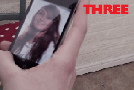
- Similarly to last year we did not need that many props or costumes. The main prop that we used was the mobile phone that the killer/stalker used to show him stalking over a picture of Emma. I think this managed to work well, showing the stalkers character in the film, which also makes them mysterious and adds to the 'eerie-ness' of the character.
- We tried to create the same effect as with the film 'Valentine' as what makes the killers in that film so scary is that you can never see the emotions on the characters face and this is something that we wanted to do with our killer.
- The only other props that were used, were the costumes which were worn by the characters. By having our narrative of the film all about a young girl getting stalked, we wanted this to give the impression of real-life horror where it could be seen by the audience as a 'it could happen to you' scenario, where they can empathies with the victims.
- The first shot that we chose was the one of our victim Emma (me), sitting on a bench in the middle of the woods. We filmed this scene using a camera, we used a long shot so we were able to fit in the location and character and this was also how the character was first introduced. We made sure that the shot was of an over the shoulder shot, so we did not reveal the face of the character. After filming this scene we watched back the action which was actually pretty frightening, as we also used a pan shot to followon from the same shot as which we had just seen but then used a pan to show that the character had now disappeared however, we wished to exaggerate this feeling in the audience. The pan was at first a little too long however, we managed to find time stretch onn Adobe Premiere and used it to speed up the pan shot. A few of the shots that we had filmed, they ended up being a little too long for our trailer however, it was good footage so decided to use it in our trailer, we managed to use time stretch again to speed up certain shots, this worked out to be effective in our trailer, as we didn't have to cut down many of our shots.
- Here is an example of our font type that we used throughout our trailer. We used 'Adobe Garamond Pro, size'120' font type in the colour white bold italic, this gave us an effective effect that really added to the atmosphere of the trailer, this font also gave the haunting effect that we see so often in horror trailers. In all three of our media texts (magazine cover, poster and teaser trailer) we changed the font throughout the texts, so all three media texts look different to one another, however you would know that all three media texts come together as one. I think the font for each media text really compliments each other and I feel it makes it look very professional.
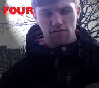
- I feel this shot helped set the narrative of the trailer where you can see David looking over towards the victim, if to say 'you're my next victim'. This adds another story involved which makes the audience want to know more and therefore want to watch the full film. We do not give off too much of the narrative of the film, although it's a horror film, stereotypically the audience know that someone is going to get killed at some point, it's just a point of when.
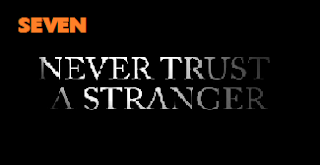
- I felt that this is a shot that really summed up the genre that we were trying to convey to the audience. The intertitle basically just says it all 'NEVER TRUST A STRANGER', a very stereotypical quote of what you would find in a horror film. The way this whole shot has been presented, represents the genre, the font type, the black and white background and lastly the effect that we added, which was to smoke out the last few letters of each word, which we wanted for our trailer and I think that we were really able to successfully do this with our trailer. I feel my group and I generally do create the moods of fear, suspense and tense within our audience when they watch our trailer.
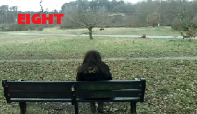
- We chose this shot to represent how we introduced our characters throughout the trailer. We only used two characters within our trailer. The two main characters are Emma (me) who plays the vulnerable victim character and David who plays the stalker/killer. The shot shown is of the victim Emma (me) whereby we used a long shot which allows the audience to see the location where the film is set and also the characters in as much/little detail that they may recognize them in the actual film but not know all the details of their face leaving a still good amount of ambiguity around the characters.
- I chose this screen grab to show how we had used special effects in our trailer. We used many different effects throughout our trailer to make it look as realistic as possible. We managed to find an effect that worked really well throughout our trailer, it was called 'Dissolve'. This effect was used to be put inbetween a few of the shots to make the trailer run smoothly, so the footage didn't jump from one scene to another, they all managed to flow together. This effect especially worked well as it managed to make one shot dissolve into the next shot, which i personally thought looked very effective in our trailer.


No comments:
Post a Comment